
|
If you're publishing on a small budget or just for personal goals, there are options for cheap cover art! While I will always recommend paying a designer and/or artist (even if it will take you a while to save up), I also know that's not reasonable for some. For a more professional look, try premade covers. I explain all that is premade covers for you. To have the experience and bragging rights, teach yourself to do it! I recommend programs and methods for teaching yourself cover art, and give you some general rules. Your cover art should be special to you first. How do you picture your book? Is it for you or your readers? Do you want it to sell? Fit in? Or be unique? If you want a more professional look, be prepared to spend a lot of time learning or pay for a premade color. If you have a specific look or logo in mind, set time aside for practice and Google searches and #DIY! PREMADE COVERS. Premade covers are covers created by designers based on a general idea, theme, or genre. Your work's title and your name are simply inserted into the design. There are plenty of premade covers out there on the internet, and you may be able to find one that fits your work. They are priced usually around 40-150$. 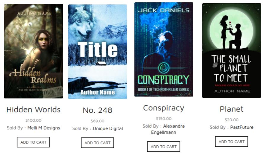 CHEAPER. A premade cover should be cheaper than paying an artist and a designer, though there are some pricey ones for premades with more design elements. UNIQUE, BUT FITS IN. Premades are unique in that, once you purchase a design, it is no longer available for others. However, premades are not very different from other covers in your work's genre; your cover is going to fit in, which can be a marketing issue as you need to tell reader's why they should pick your book over others. GENERAL LOOK. Premades visualize a broad book idea. This means you may not find something that perfectly captures your work, but only something generally related to it. However, some designers also offer customization if you are willing to spend more. DO IT YOURSELF. There are ways to teach yourself book design and create your own cover. However, I would only do this if you: are already artistically and/or design skilled, are willing to put in a LARGE amount of time to learn, don't care for a professional look, or are only publishing for personal reasons. You can also save some money by doing part of the cover yourself: you can pay an artist and design the typography, or vice versa. INSPIRATION. Before you delve into it, study book design of your work's genre. Look at similar books on Amazon. Which do you like? What are the common elements? Colors? How can your cover fit in? Stand out? What would you like to do? What's easiest? Download a few cover images to keep for reference. PHOTO EDITING/ART SOFTWARE. In order to design and create art for a cover, you’re going to need software. Adobe Photoshop is my go to, but Gimp is a free, slightly different photo editing software I’d also recommend. Photoshop will cost you about 20$ a month, but for 3 months you would have spent the same on a premade cover. With Photoshop and Gimp, you can use layering to conglomerate images or artwork to create your cover art. PLEASE NOTE: if you would like to use images from the internet, you must make sure they are available in the public domain, or you will be using someone else’s copyrighted material. On top of creating your art, you can also use these programs for typography and design. Design your own logo, add the title, your name, the blurb, etc. If you’re just doing the artwork by hand and hiring a designer for the typography, while you can draw and color on Gimp and Photoshop, I recommend a different free art software: Autodesk Sketchbook. Sketchbook files are also compatible with Photoshop! Whichever program you’re using, I recommend playing around on it before you jump into your cover. Test every button, what does it do? Right click, left click, click and hold. Place objects and text around and see how you can change them. THE INTERNET. The internet is at your fingertips: ask it anything! Once you have a general idea for your cover, start looking into how you bring that idea to life. Use google searches and youtube to teach you basic program skills. For example, if you’d like to use photoshop but never have before, you may want to watch some basic tutorial videos before you purchase it. Or, say you don’t know what one of the tools are for, but you would like to know. You can search for a tutorial on that specific tool. The name should show when you hover over the tools icon. Furthermore, you can use google to learn more specific things. For example, if you notice that the text on one of your saved cover designs is glowing pink, you can search “how to make text glow pink in gimp”. Use the internet for feedback! Join cover or book genre facebook groups and ask friends and family what they think about the cover you’ve created so far. Use this feedback to upgrade your work! DIMENSIONS. Make sure your cover art and design fits the dimensions of your piece. You can use the program to place lines to mark certain areas. Mark the front page, spine, back page, and flaps if you have a hardcover. COVER ART. The art for your cover needs to have an object or character as the centerpiece on the front page. You need to make sure the art is not too busy, distracting from this centerpiece. Make sure you pay attention to the spacing and the busyness of your art. If there is something in the top left behind the main focus, is there something across from it to bring balance to the art. Pay attention to blank space. Is it even? Is there too much or too little? Cover art should have a few common colors, and not too many greatly different colors. It should display a theme or tone of your work. It needs to sell your book; catch passerbys’ attention. DESIGN. Like your art, you need to pay attention to the spacing and busyness of your design. Does the design throw off the balance of the artwork? Or can you use typography to create balance? If the art is very busy on the top, put all your typography on the bottom. Is the spacing between the edge and both sides of your typography equal? Is there more spacing on the top but less on the bottom? When cover art is complete, design brings in the sparkling finishing touches. It’s placement is very important, and so the balance of your piece can be very delicate. Make sure you never use more than two fonts on your cover, as too many can be distracting and too busy. The color of your text should mostly be the same, and match some color in your art. For example, the golden yellow text I use for A Vow to Fury is the gold used on the dragon. For design, make sure you have the following: title, author name, spine text, blurb and/or book reviews, a white box for the barcode, and copyright for artists/you if they’d like credit on the cover. You can optionally have: logos, website links, pricing, tag lines, and whatever else you’d like. For hard covers, I recommend moving the About the Author to the flap instead of having it within the book. Don't get frustrated! Go out there and create or purchase some cover art! 
0 Comments
Leave a Reply. |
